Know the difference between an eye-catching, action-inspiring poster, and just another piece of paper you’ll pass by? The poster layout! So long as they’re designed and laid out with intention, posters offer a tried-and-true way to draw attention to sales, events, fundraisers and more. That said, it’s not always easy to know how to do that on your own.
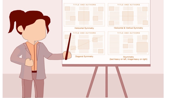
The poster layout refers to the look, feel and organization of elements in your poster. This encompasses the poster’s design elements and visual qualities — such as the colour palette, font choices, design style, contrast and use of white space — as well as how information is laid out on the page. You can see how each design element — the headline and accompanying text organized within a single vertical column, the bold, saturated image as the poster background and the interplay between colours — are composed with a purpose. Plus, these stylistic choices are not just a creative exercise in poster design, nor are they simply eye-catching to look at. They reinforce the design principle of visual hierarchy, capturing and funnelling attention down the page towards a desired action.
With the right poster layout, your content won’t just be visually appealing — your message will be strengthened to boot. Given you have an entire canvas to work with, you have a lot of freedom to make poster layout choices. But don’t let that intimidate you! There are a variety of poster layouts out there — and even more terms used to describe them. For now, we’ll take a look at some of the most common types you’ll come across.
A layout that organizes information within a single column is perhaps the most widely used layout around. These designs stack all the information within one vertical column, simplifying the reading experience by streamlining it into one continuous flow from top to bottom — just like how we scan a document. Even without impressive images or icons, single column posters can spark interest.
Design tip: Choose bold fonts and font sizes to make the most out of a minimalistic approach.
Sometimes it takes two to drive your point home. By that I mean, poster layouts featuring two columns of content. These kinds of designs utilize two distinct zones to distribute information within a single page, like so:
The key difference here is that this event requires more explanation — e.g. additional details around who the featured speakers are — to entice. Point being: if you need more textual components to explain a concept or or persuade viewers, a two-column design might do the trick.
Double column layouts are also a great option for information-rich content, such as infographic posters — i.e. posters focused primarily on telling a story, or explaining a process, through text, visuals and/or data.
Since this division lays out the information within distinct, separate blocks, it’s easier to highlight different kinds of information effectively.
Design tip: choose one (max two) accent colour(s) to break up your sections while adding visual interest.
Of course, you can opt to create a multi column, or hybrid, layout for you poster. These kinds of layouts are effective if you:
Design tip: use icons to represent each step in a process, add visual interest and break up the text.
Knowing these facts from the start will help you understand whether a one or two column layout is the right choice for you. And yet, even with all these tips on hand, the thought of designing a poster from scratch can still be intimidating. That’s why a poster template will give you a solid foundation to create your own design! You can always simplify the process with a pre-made poster template like the ones we offer <<here>>. Still confused then why not use our <<poster design selector>> for inspiration.


Advisory board meetings are often used to address perceived knowledge gaps and build consensus.

The largest pharmaceutical companies not surprisingly rely on the largest contract research organizations

Scientific knowledge should be accessible to all and if you are those communicating science
Get our latest news and publications
Sign up to our news letterResources
Social


Contact us
Address
Niche Science & Technology
Unit 26 Falstaff House
Bardolph Road
Richmond TW9 2LH
United Kingdom
